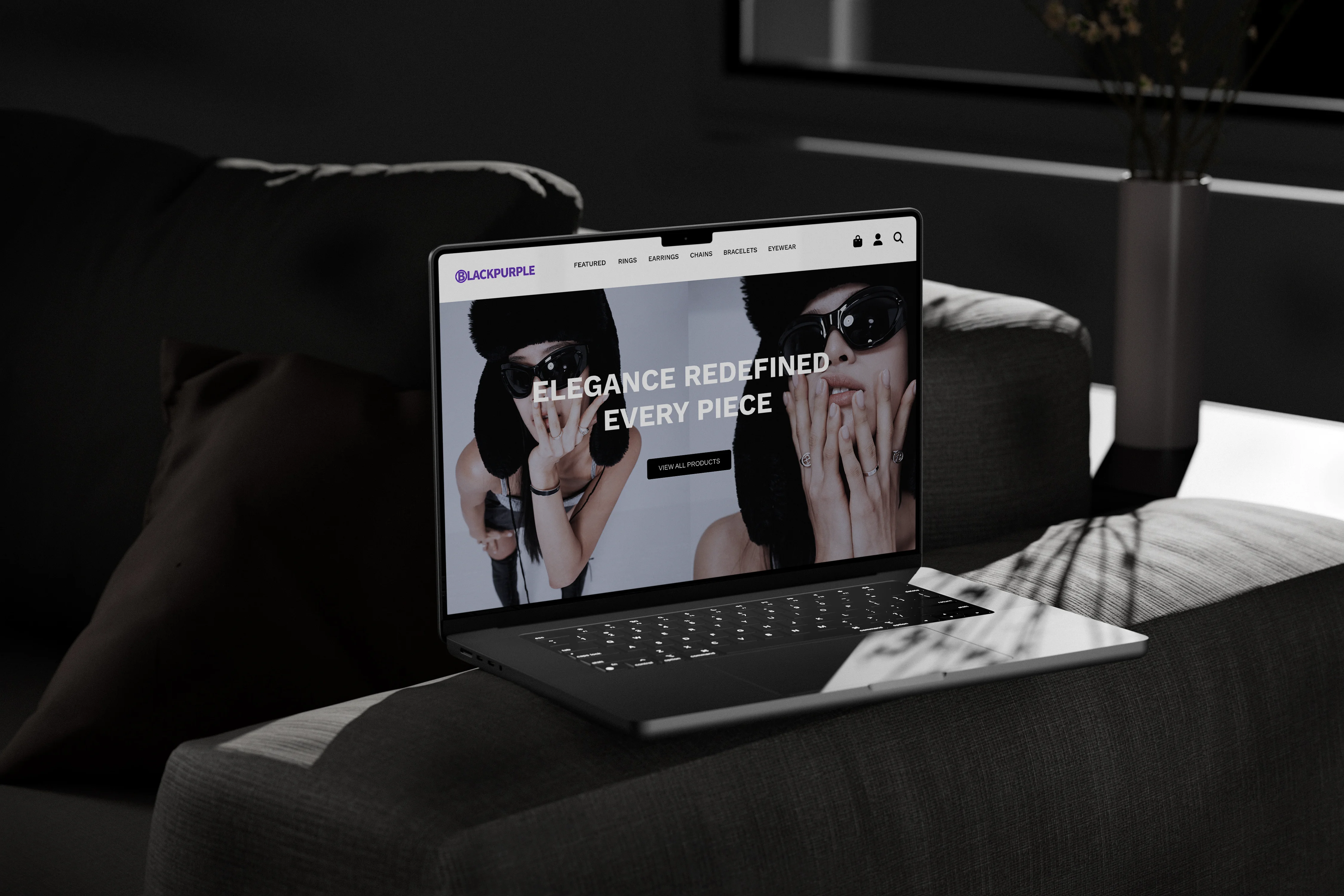
Black Purple
Project Overview
Project Type
Website Redesign | 2025
Tools
Figma, Illustrator, Notion, Similar Web
Project Timeline
3 weeks
Role
UX/UI Designer
Executive Summary
Research Question
"How can Black Purple’s website be redesigned to reduce bounce rates, improve engagement, enhance the user experience, increase conversions and improve website traffic?"
Methodology
Competitive Analysis: Examined bounce rates, traffic flow, and drop-off points to understand user behavior.
UI Audit: Assessed design consistency, layout clarity, and navigation structure.
Usability Testing: Observed user interactions to pinpoint friction points and gather qualitative feedback.
Key Insights
Users frequently left the site early, indicating engagement and usability issues.
Recommendations for the App
Based on the key insights found, the following features were recommended: reduce menu categories, clear product groupings, and improved visual hierarchy.
Introduction
Black Purple is a jewelry brand based in Seoul, Korea, catering to a fashion audience offering a selection of bold, stylish accessories. The brand embraces a modern, edgy, rebellious aesthetic.
Problem
SimilarWeb data, a UI audit, and usability testing reveal high bounce rates, low traffic, and frequent drop-offs on Black Purple’s site. Poor navigation, excessive menu categories, and an overwhelming layout further disrupt the shopping experience.
Goal
The goal of this redesign is to improve the website’s user interface to reduce drop-offs, high bounce rates, and low traffic. By optimizing the layout, navigation, and enhancing the overall user experience, the redesign aims to increase page visit times, engagement, and conversion rates.
Research
I began my research with collecting data from the website using SimilarWeb, a website traffic analysis tool, to gather data on Black Purple’s monthly visits, bounce rate, pages per visit, and overall traffic.
Next, I used competitive analysis comparing the websites data. Based on those insights I explored Reddit to understand common frustrations that drive people away from online shopping. I decided to conducted a UI audit to identify issues within the website’s design, followed by usability testing with user flows to gain deeper insights into the navigation experience and checkout process.
Competitive Analysis / Inspiration
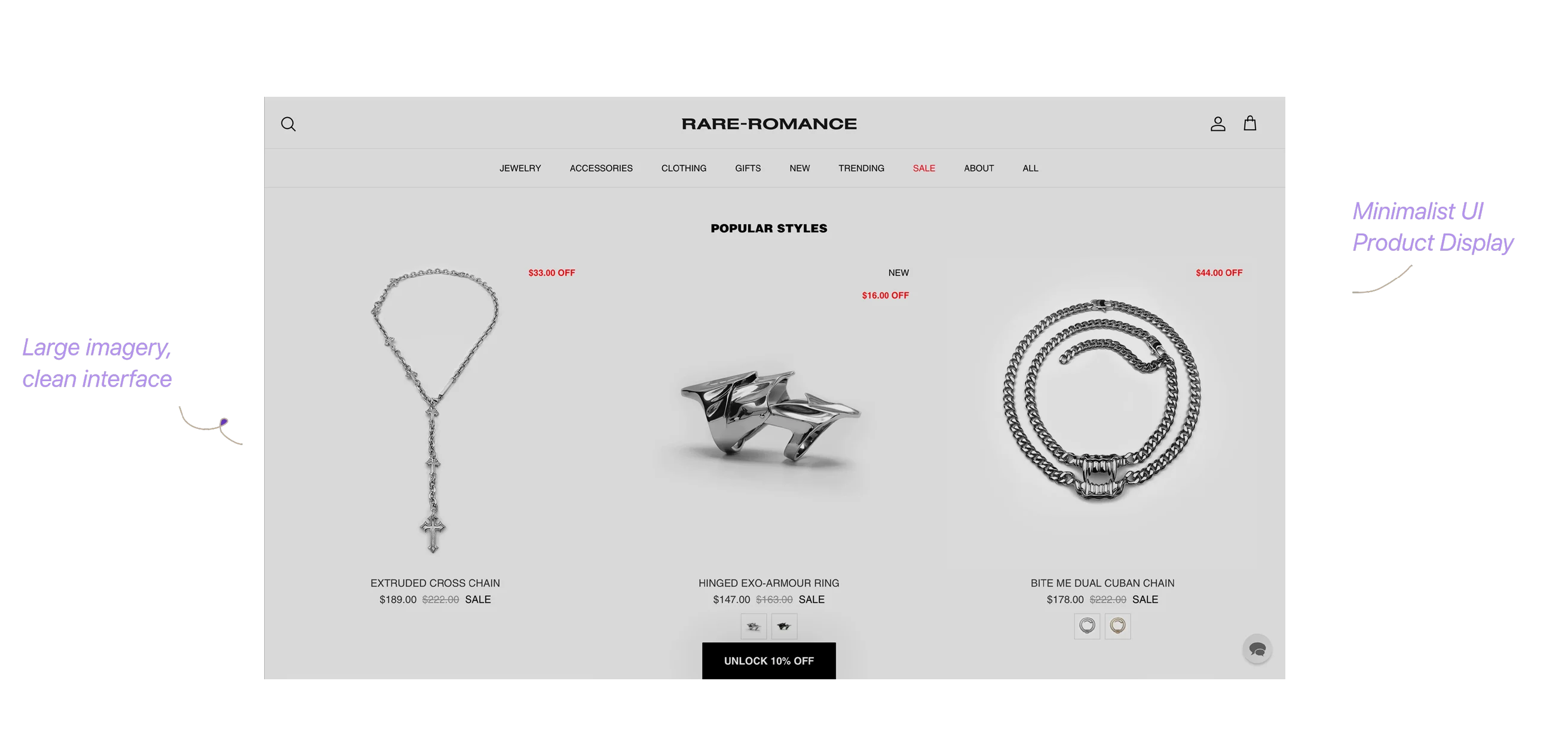
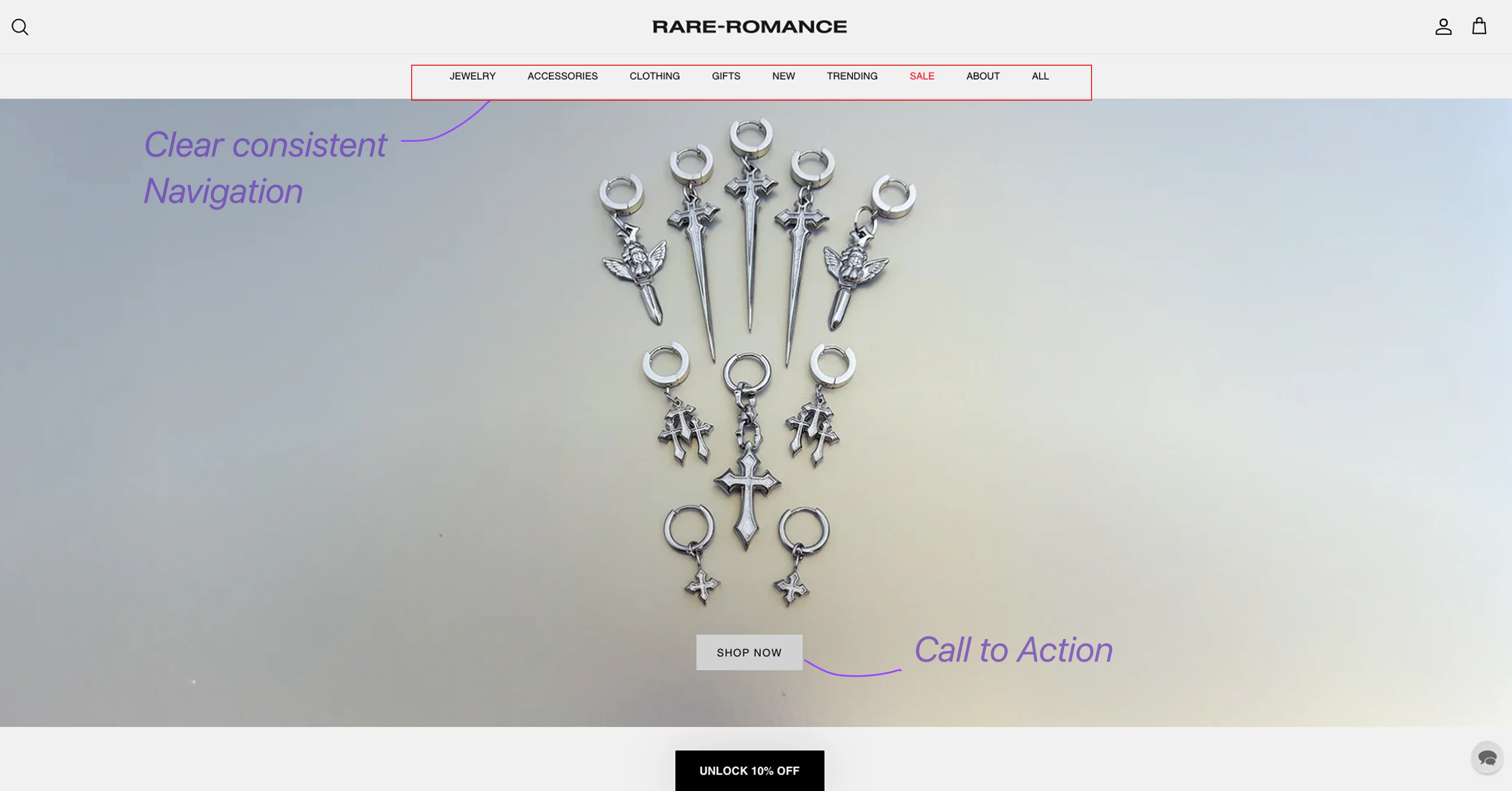
Black Purple’s site has high bounce rates, low traffic, and frequent drop-offs, and is underperforming against competitors like Rare Romance.
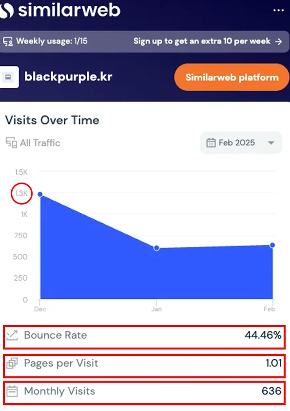
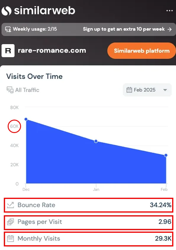
Based on the insights from the website traffic data I decided to look through to find out more about how users feel with e-commerce webites. Reddit users highlight frustrations with missing basic website essentials, making shopping difficult.

UI Audit and Usability Testing
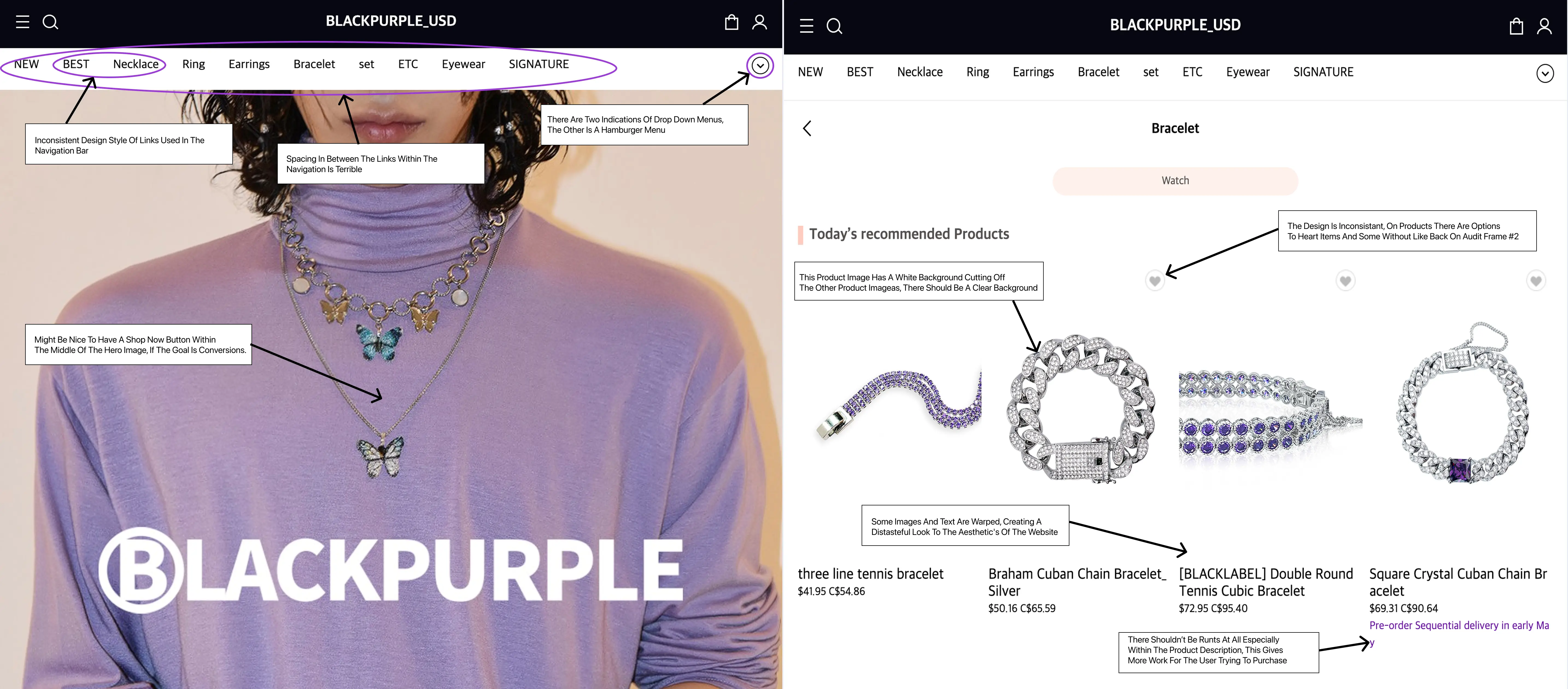
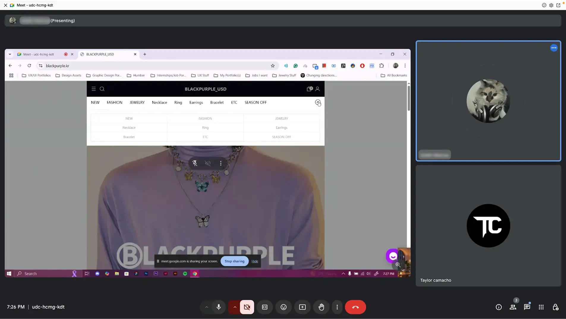
After reviewing how people felt about some websites on reddit, I decided to conduct a UI Audit and Usability Testing to identify the main issues within the website.
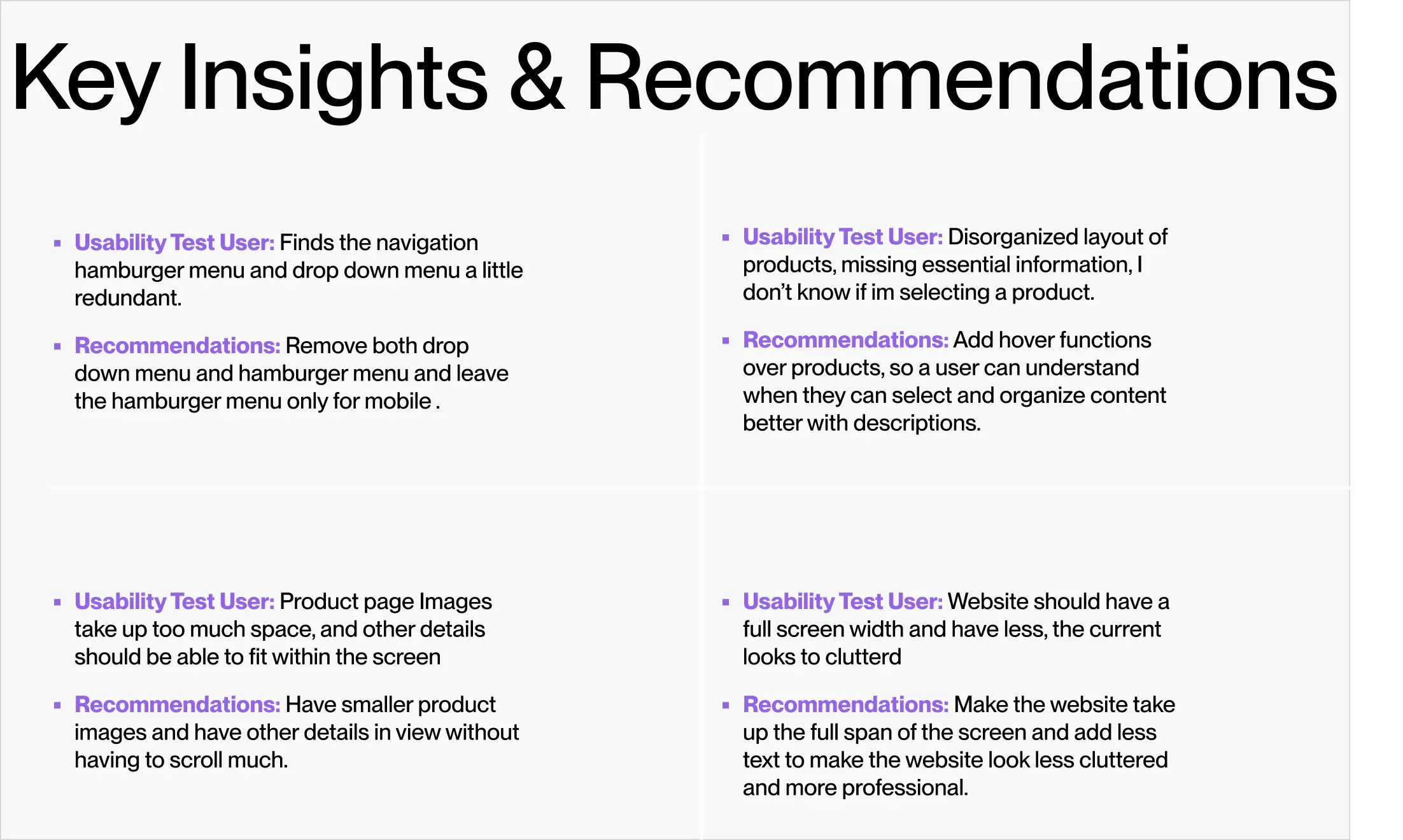
After conducting a UI audit and 2 usability testings these were they key issues I found.
Final Design
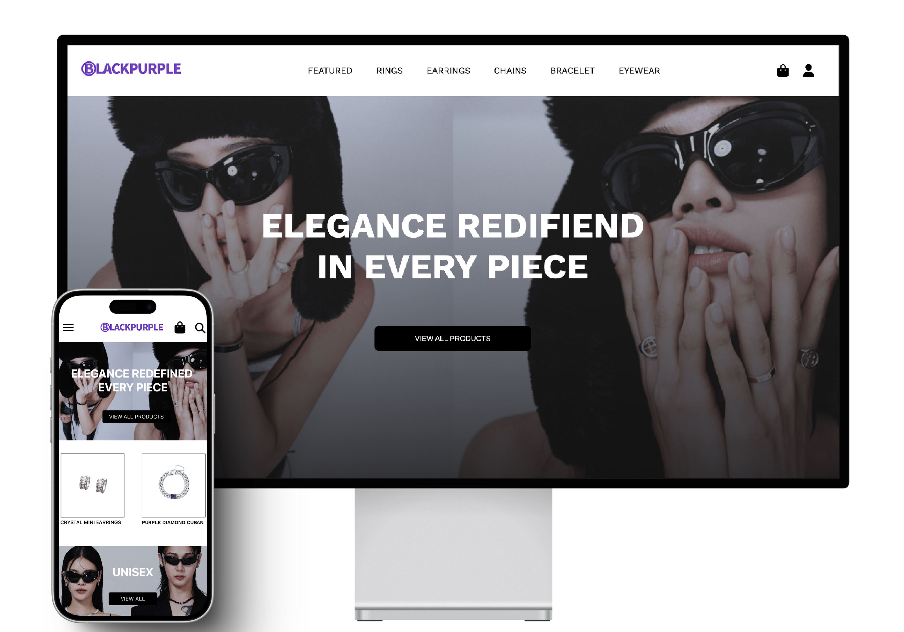
The final design was informed by key insights gathered from usability testing, the UI audit, and competitive analysis to reduce bounce rates, improve engagement, enhance the user experience, increase conversions and improve website traffic.
Conclusion
The website redesign addressed key usability issues by simplifying navigation and decluttering the UI. Data from SimilarWeb, a UI audit, usability testing, and Reddit reviews revealed that poor navigation, an overwhelming layout, and a complicated checkout process led to high bounce rates and low engagement. The redesign leveraged these insights to implement a cleaner layout, intuitive navigation, and a seamless checkout experience, ultimately improving conversions and customer retention.
Future Steps
While the redesign has significantly improved the user experience, navigation, and checkout process, moving forward, the next steps would be to deploy the redesign and track key metrics (bounce rates, session duration, and checkout completion) to measure success.
Contents